Playpen Configuration
Introduction
This section outlines available options for setting up and managing a playpen, configurable on the Django Administration UI. The table below provides descriptions of each configuration setting.
| Configuration Name | Type | Description |
|---|---|---|
| required_comment | Bool | Determines whether users are required to provide comments for each action in the playpen. |
| required_upload_approval | Bool | When set to true, uploads can only be selected after they have been approved. |
| require_methodology_selection | Bool | Setting this flag to true will require users to select a methodology before saving a study. |
| require_scenario_selection | Bool | Setting this flag to true will require users to select scenarios before saving a study. |
| hide_scenario_selection | Bool | Setting this flag to true will remove the scenarios tab from the build study screen. |
| disable_scenario_weighting | Bool | Setting this flag to true will hide the scenario weighting graphic and weight input. Unlike hide_scenario_selection, users can still select scenarios, but they will not be able to specify weights. |
| disable_model_unit_test | Bool | Setting this to true will remove the model run section from the model screen. |
| run_study_options | JSON | A user-customizable run study options in JSON format. |
| build_study_options | JSON | A user-customizable build study options in JSON format. |
| model_meta_options | JSON | A user-customizable model metadata form in JSON format. |
Info
Modifying build_study_options, require_scenario_selection,
hide_scenario_selection or require_methodology_selection will archive
all existing studies in the selected playpen.
Tip
Users can customize their playpen configuration in the Django Admin Page at:
<hostname>:8000/playpen-configuration/<playpen-configuration-id>
(e.g., http://localhost:8000/playpen-configuration/1).
Options
The configurations run_study_options and build_study_options are
user-customizable runtime options that can be retrieved by user via the SDK API.
For more details, see SDK Run Object section.
The types of configurable runtime options include:
datepickerdropdownsliderswitchtext-box
Each option is a JSON object with multiple fields. The essential fields in each
option include name, label, and type. Below is a breakdown of shared
fields and type-specific fields.
Shared Fields
The table below provides descriptions of fields that are common across different option types:
| Field Name | Type | Required / Optional | Description |
|---|---|---|---|
| name | String | Required | A unique identifier for the option. |
| label | String | Required | A display label for the option. |
| type | String | Required | Specifies the component type (datepicker, dropdown, slider, switch, text-box and table). |
| prompt | String | Optional | A prompt or supplementary label shown in some components. |
| value | Any | Optional | The default value for the option. |
| required | Bool | Optional | A flag for an input component. If an entry is required, the user must provide it before submitting the form. |
| placeholder | String | Optional | A placeholder text shown in the input field of some components when the field is empty. |
Type-specific Fields
The tables below provide descriptions of fields that are unique to each component type:
datepicker
| Field Name | Type | Required / Optional | Description |
|---|---|---|---|
| min | Date String | Optional | Minimum valid date. |
| max | Date String | Optional | Maximum valid date. |
dropdown
| Field Name | Type | Required / Optional | Description |
|---|---|---|---|
| options | Object | Required | A list of options to choose from. Definition: options: { key: string; label: string; }[]; |
slider
| Field Name | Type | Required / Optional | Description |
|---|---|---|---|
| min | Number | Required | Minimum valid number. |
| max | Number | Required | Maximum valid number. |
| step | Number | Required | Increment/decrement step for the slider. |
| format | String | Optional | Format string in typescript string interpolation style for slider display. For example, when value = 100, "${value}" returns "100" and "${value}%" returns "100%". |
text-box
| Field Name | Type | Required / Optional | Description |
|---|---|---|---|
| multiline | Bool | Optional | Flag that determines whether the text box accepts multiple lines. |
| rows | Number | Optional | Maximum number of rows shown in the text box, if multiline is true. |
| format | String | Optional | Format for the text input (color, email, month, number, password, search, tel, text, time, url, and week). |
table(Only forrun_study_options)
| Field Name | Type | Required / Optional | Description |
|---|---|---|---|
| object | String | Required | Defines which risk object to populate the table with (upload, model, config_group, methodology, study, filter, or report). |
| multi | Bool | Optional | Ignored by the current Run Studies page, which selects a single object per tab. |
| typeFilter | String | Optional | Allows you to filter the list of available objects by type. Enter the type code of the type you would like to filter by (e.g., for filters, specifying PORTFOLIO will show only Portfolio Filters. |
Examples
This section illustrates some examples with detailed descriptions on how users can define each option. It also covers how each type of option appears, how it behaves when interacted with, and what it looks like after a user fills in the information (if applicable).
Datepicker
Sample config:
    {
        "name": "as_of_date",
        "type": "datepicker",
        "label": "Select as of Date",
        "prompt": "Choose a date"
    }
Illustration:
-
Initial View
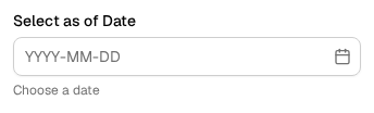
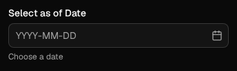
- The option appears as a simple input field with a prompt (if defined).
-
Date Selection
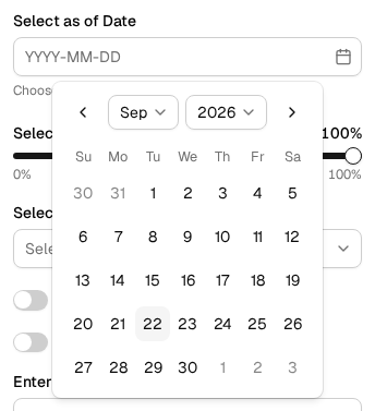
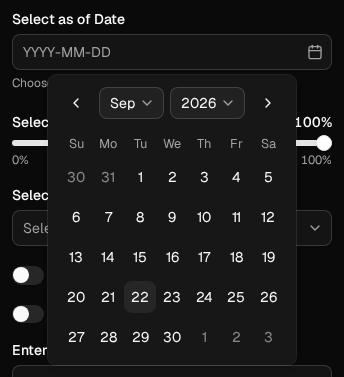
- After clicking the icon, a calendar view pops up, allowing user to select a specific date.
-
After Selection
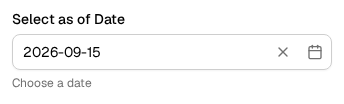
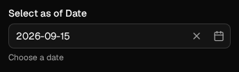
- The selected date is displayed in the input field, replacing the placeholder text (if defined).
Dropdown
Sample config:
    {
        "name": "output_currency",
        "type": "dropdown",
        "label": "Select Output Currency",
        "value": "",
        "options": [
            {
                "key": "USD",
                "label": "USD"
            },
            {
                "key": "CAD",
                "label": "CAD"
            },
            {
                "key": "EUR",
                "label": "EUR"
            },
            {
                "key": "JPY",
                "label": "JPY"
            },
            {
                "key": "MYR",
                "label": "MYR"
            },
            {
                "key": "GBP",
                "label": "GBP"
            }
        ]
    }
Illustration:
-
Initial View:
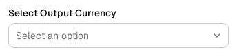
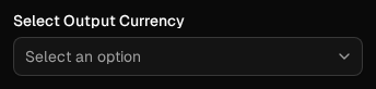
- The dropdown appears with a placeholder text (if defined).
-
Options Display:
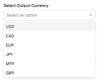
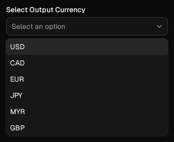
- Clicking the dropdown displays a list of available options defined.
-
After Selection:
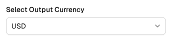
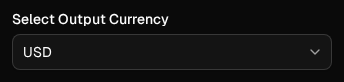
- The selected option is displayed in the dropdown field, replacing the placeholder (if defined).
Slider
Sample config:
    {
        "max": 100,
        "min": 0,
        "name": "percent_to_process",
        "type": "slider",
        "label": "Select Percent to Process",
        "value": 100,
        "format": "${value}%"
    }
Illustration:
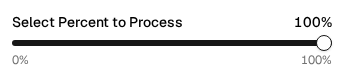

- The slider allows user to drag in between the
minandmaxvalues defined displaying the current value in real time as user drags the slider handle.
Switch
Sample config:
    {
        "name": "save_results",
        "type": "switch",
        "label": "Save Results",
        "value": false,
        "prompt": "Save"
    }
Illustration:


- The option appears as a toggle button. Users can click the button to switch its state.
Text box
Sample config:
    {
        "name": "email",
        "type": "text-box",
        "label": "Enter Email information",
        "prompt": "Enter Email information"
    }
Illustration:
-
Initial View:
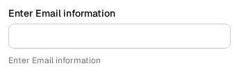

- The option is displayed as an input field with label defined.
-
Text Entering:
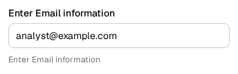
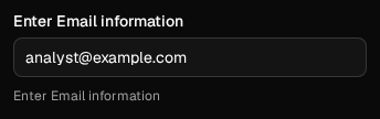
- As users type, the entered text is displayed within the text box. If multiline is set to true, the field expands to accommodate more text.
Table
Sample config:
    {
        "name": "uploads",
        "type": "table",
        "label": "Data",
        "object": "upload"
    }
Illustration:
-
Extra Tab:


- Each
tableoption adds a tab to theRun Studiespage, labelled with the option'slabel. Theuploadsoption above addsData.
Tip
See the Uploads page for how to upload files.
-
Object Selection:


- Each tab lists the playpen's objects of the configured type; select
the one the run should use. Shown here is a
filteroption withtypeFilterset toPORTFOLIO, so the tab lists portfolio filters only.
See also
- Playpen Management for creating and administering playpens on a deployed system.